Houston Bathroom Remodel Is An En Suite Success!
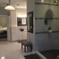
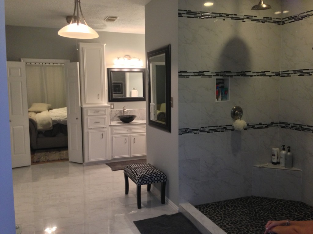
This Houston bathroom remodel has it all – from its contemporary, en suite design to its Carrara marble to its luxury spa shower and his-and-her closets!
It’s just one example of our Houston bathroom remodeling projects – known for their meticulous attention to beauty and perfection.
Like what you see and want your own Houston bathroom remodeled? Just contact us!
Here are some more project shots and details.
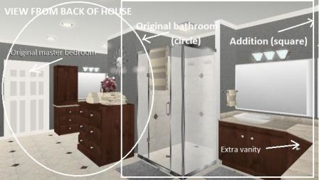
“You’ll notice a lot of differences between the original renderings and the final project,” notes Wayne Franks, owner of Outdoor Homescapes of Houston. “That’s why our realistic, detailed 3D graphic renderings and virtual video tours are so useful to clients who can’t visualize the end result in their heads. With us, they can preview the project from every angle and make sure they get exactly what they want.”
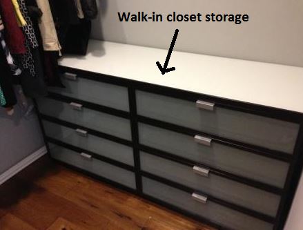
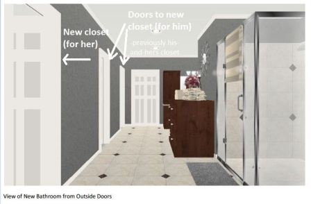
This is the new, 10-foot-long by 4-feet-deep closet for her. It was built along the wall of the new addition, as you can see in the 3D graphic created for the client below.
The first door on the left (above) leads to this closet. The next two doors down lead to the original, 6-foot-long by 4-feet-long by 4-feet-deep closet shared by the couple, but now reserved for him.
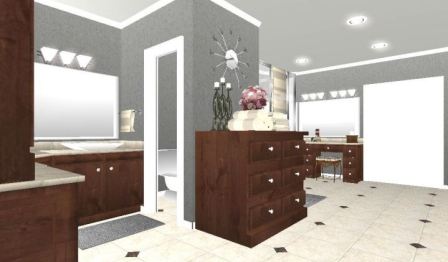
As you can see in the graphic below, a small, private commode was added onto the back of the new shower. Recessed lighting was also added for more ambient light, along with brushed nickel lighting fixtures.
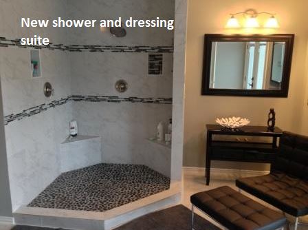
The closeup of the new shower and dressing suite, meanwhile, shows the black-and-grey border and accents in the shower. The border and accents are a stone-and-glass tile mix from Floor & Décor. The shower floor – a flat mosaic marble pebble – is also from Floor & Décor.
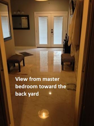
And here’s a view of the Houston bath remodel, looking toward the back yard from the master bedroom. On the right, after the towel hooks and before the French doors, a flat-screen TV has been added for viewing from the shower and dressing area.
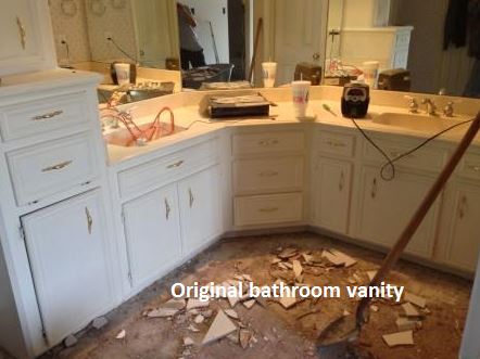
This Houston bathroom remodel sprung out of a bachelor’s engagement. The original, 300-square-foot master bathroom – still in the 80s with brass fixtures and wallpaper – desperately needed a redesign that could accommodate his future bride.
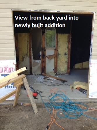
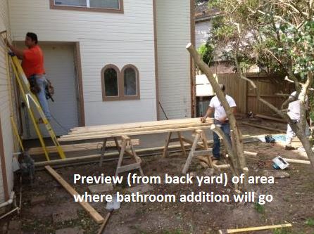
So we gutted the original bathroom and doubled the size with a 300-square-foot addition off the back of the house.
Here’s a full-on view of the project. (This is where our 3D graphic renderings, which allow clients to preview their project from every angle and make changes, come in handy. As you can see, the client went with white instead of dark-wood vanity cabinets, ditched the glass shower surround and scrapped the second vanity area).
Question: What do you like best about this Houston bathroom remodel? What would you do different? Post a comment and let us know!

