Houston Remodel is Perfection, Inside And Out
In this beautiful Houston remodel, we gave the exterior AND interior a complete makeover – with a new outdoor kitchen, patio cover and balcony outside and a Mid-Century Modern redesign on the inside:

“This project was really unique, not only in the extensive scope of it, but in the number of different elements needing to be coordinated with each other,” says Outdoor Homescapes of Houston owner Wayne Franks. “And our entire team really rose to the challenge.”
Here’s a roundup of photos and details.
Like what you see and want your own upgrades? All you have to do is contact us!
Exterior work
The new outdoor living space for the client – a Houston couple and their two teenage sons – includes a 14 x 20-foot patio addition with an outdoor kitchen and balcony.
Here’s a before-and-after shot of the entire exterior:


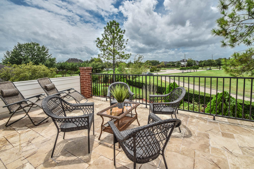
And here’s a close-up of the finished balcony:
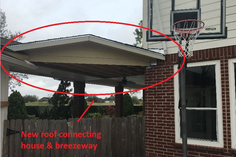
We also extended the roof over the patio between the house and the breezeway (the new section is 26 x 14 feet):
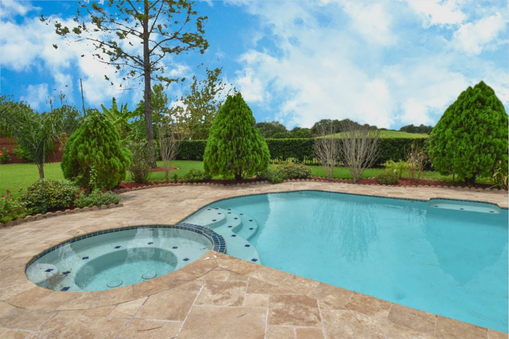
On the patio and balcony, we laid about 1,100-square foot of new hardscaping in the place of pea gravel. The new material is a gorgeous, honed-and-filled Nysa travertine tile in a Versailles pattern. We used the same tile for the new pool coping, too.
Here’s a close-up of the tile around the pool:
We also added French doors leading to the patio and balcony from a lower bedroom and upper game room, respectively:
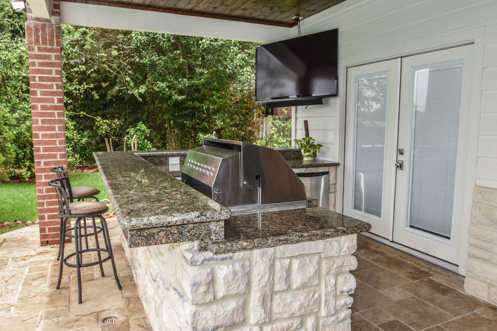
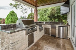
Also shown in the photo above: Southern Cream cobblestone on the outdoor kitchen island and Titanium granite for the countertop and raised bar.
The 8 x 12-foot, L-shaped kitchen island houses all RCS stainless steel appliances: a 27-inch grill, ice maker, lowered power burner, fridge and sink.
The new outdoor ceiling is tongue-and-groove pine boards in the Minwax stain “Jacobean.”
“We always start with the biggest element in the space and work around that,” explains Lisha Maxey, senior designer at Outdoor Homescapes and owner of LGH Interiors in Houston. “In this case, it was definitely the travertine tile that we coordinated around.”
Interior redo
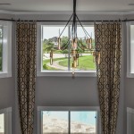
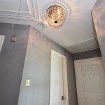
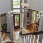
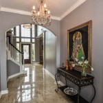
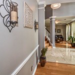
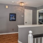
Inside, we repainted the entire house from top to bottom, including baseboards, doors, crown moulding and cabinets. We also updated the lighting throughout (click on any image in the gallery to make it bigger):
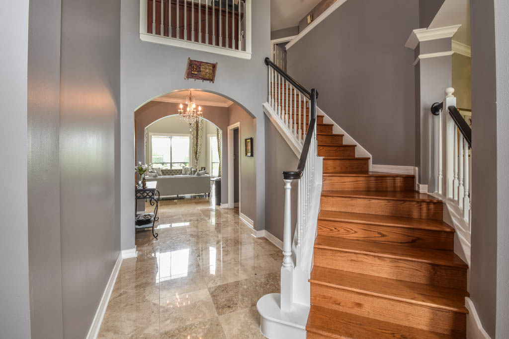
“Their style before was really non-existent,” says Lisha. “They did what most families do – got items when they needed them, worrying less about creating a unified style for the home.”
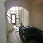
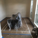
BEFORE SHOTS:
Other than a new travertine tile floor the client had put in 6 months earlier, the space had never been updated. The drapery had been there for 15 years. The wallpaper border and old window blinds had to go. And the living room had an enormous leather sectional couch that virtually filled the entire room.
In its place, we put all new, Mid-Century Modern furniture and from World Market. The drapery fabric and chandelier came from High Fashion Home:
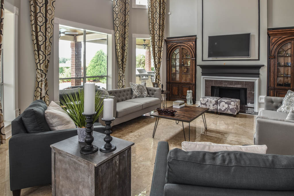
All the other new sconces and chandeliers throughout the house came from Pottery Barn and all the other décor accents from World Market.
Everyone got bedroom makeovers as well.
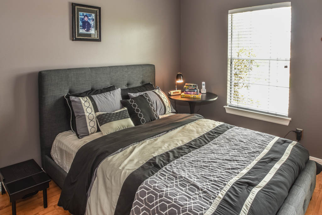
One of the sons, for instance, started with childish bunk beds and piles of books everywhere.
“We gave him a grown-up space he could enjoy well into his high school years,” says Lisha.
The new bed is from World Market:
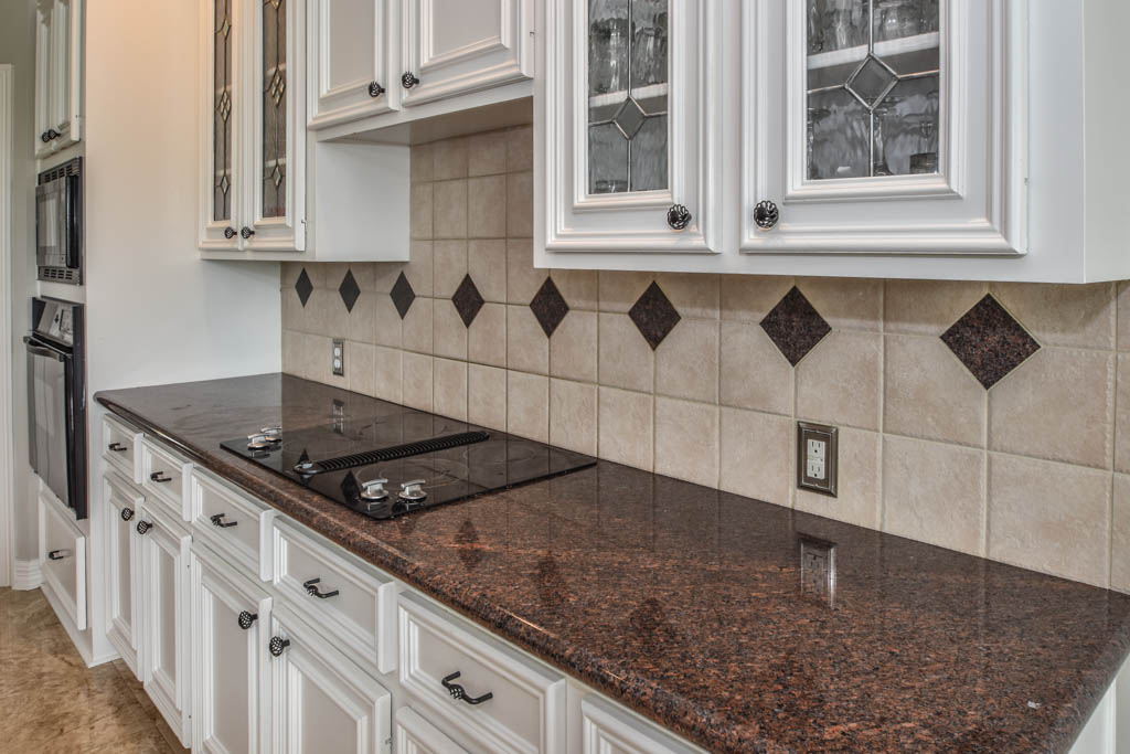
We also updated the kitchen by removing all the old wallpaper and window blinds and adding new paint and knobs and pulls for the cabinets. (The family plans to update the backsplash later.)
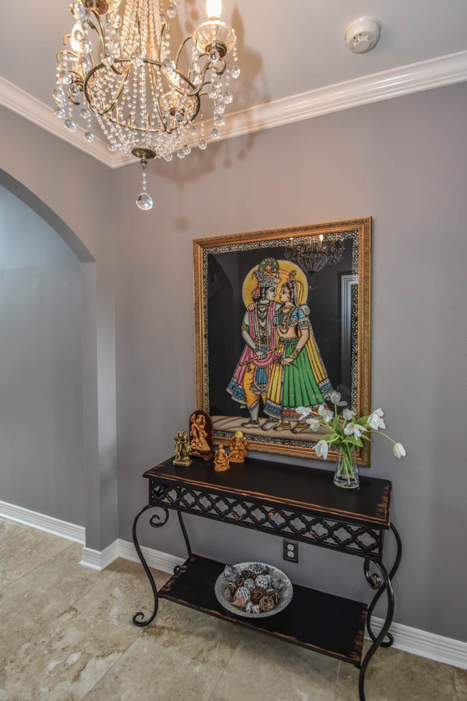
The top handrail on the stairs, meanwhile, got a coat of black paint, and we added a console table (from Kirkland’s) in the downstairs hallway:
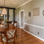
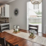
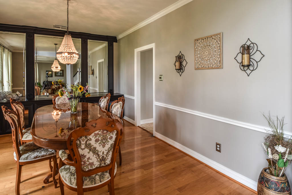
In the dining room, we painted the cabinet and mirror frames black and added new drapes, but kept the existing furniture and flooring
“I’m just so pleased with how it turned out – especially Lisha’s coordination of all the materials and finishes,” says Wayne. “But as a full-service outdoor design team, this is what we do, and our all our great reviews are telling us we’re doing it well.”
Leave a Reply

